Nude
Nude is a fintech specialising in helping first time buyers to save for their first homes.
I started working with Nude in April 2022, first as a freelancer, then as a permanent member of the team and design lead.
I started working with Nude in April 2022, first as a freelancer, then as a permanent member of the team and design lead.
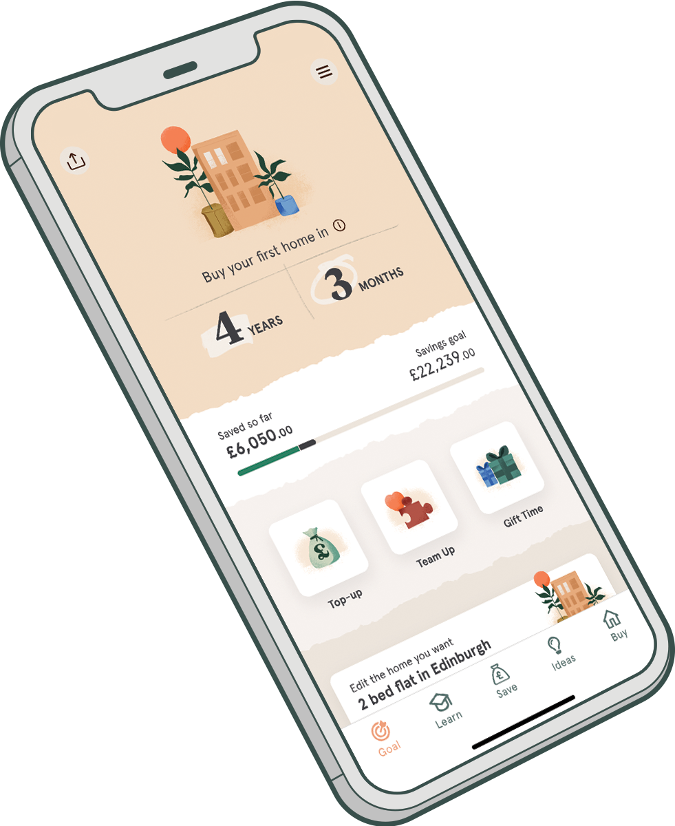
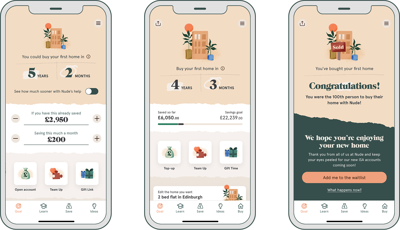
Progression from free user to paid to home owner
My time with Nude was my first permanent job since 2016, joining a small, talented and motivated team was a great experience, as well as the chance to truly own and develop design, both within the product and the business, something that was often a challenge in freelance roles and contracts. We did so much work that it would be unpractical to list it all! Here, I’ll focus on some highlights and a general overview of the work I was proud of here, which was nominated for a number of awards, including an 11:FS one in late 2022.
Examples of design issues prior to my joining the team
When I joined the team they had been without any design resource for some time, having previously had two product designers. My first few months were focused on building up design within the team, establishing proper ways of working and process that had broken down in the spell where the team had been forced to work around the absence of design. This covered everything from establishing process and design sign off sessions with development, to having to rebuild Figma files and the design library to sync up with how the app actually looked and behaved in live, such had been the drift and lack of communication between teams before that point.
Following that, my next goal was to bring consistency, on top of the aforementioned design issues, Nude was reaching the end of that ‘first’ product phase at the time; the core stuff was done and live, but the fast pace and various designers being involved had meant that while it was quite aesthetically pleasing, it was very inconsistent; multiple components and visual styles doing the same jobs, CTA approaches changing from section to section etc. A thorough review and standardisation project isn’t the most exciting thing to get buy in for, but it improved things greatly, giving a much more solid base to build on going forward.
The same 3 screens but with new consistent components, headers etc
Similarly, the team hadn’t had much experience with testing or research, the core feature set had largely been internally driven, while some of these turned out to be successes, such as the clear ‘countdown to buy’ on the home page, it had led to others that, while they sounded good in principle, they turned out to have fairly limited use in practice, such as the ‘Gift Link’ feature that would allow family / friends to pay into a user’s account to help with their saving. Sounded great, but just didn’t land with the users as had been hoped. Working closely with the Head of Product we pushed strongly for increased customer interviews, feedback and proper user testing sessions, to better understand what we had, and review what we were working on.
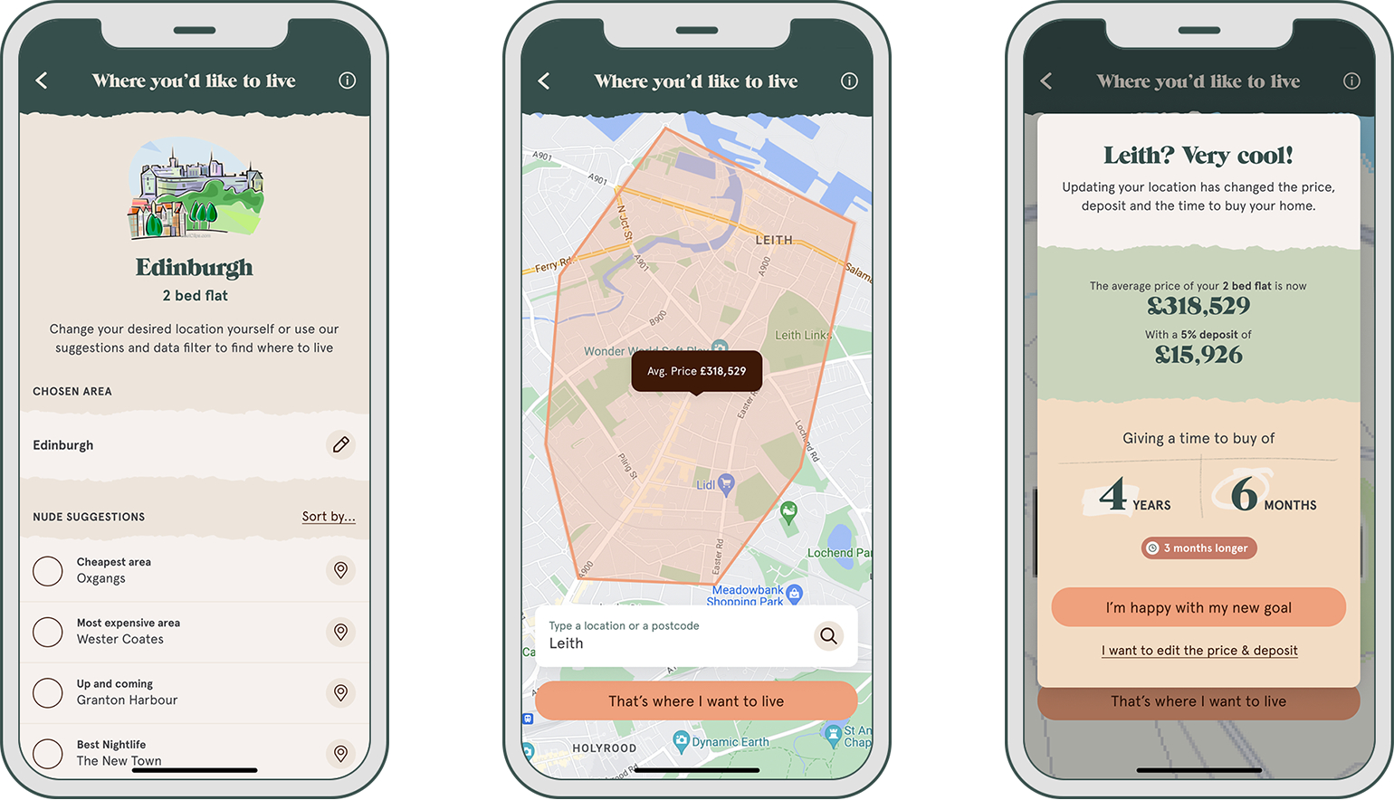
Location refinement could be driven by price, good schools data etc
I’ll showcase some general examples of work done now, with some of the ‘meatier’ ones in their own dedicated case studies.
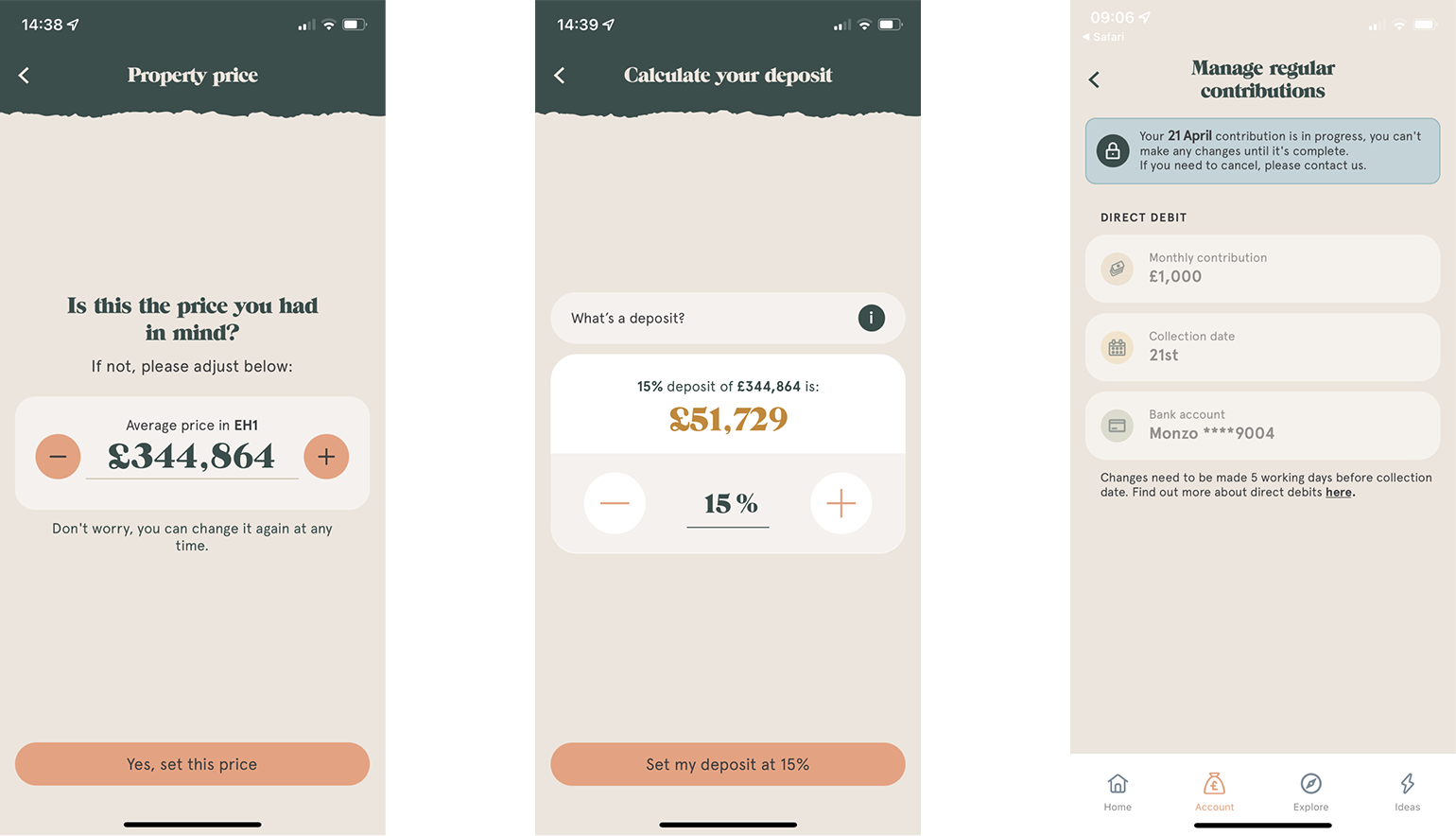
Among some of the more fun projects, I worked up enhancements to what Nude calls ‘Home Discovery’ – the tools that let users choose where they want to live and find out how much it would cost, adding location filters and home customisation options. We were always keen on being both informative and playful, so allowing users to customise their chosen home to their liking, whether by location or whether they wanted a balcony seemed to fit nicely with that ethos. We also looked at more fun ‘what if’ scenarios; where could the user afford the biggest or smallest home for their budget, where in the country would they have the most choice etc. These also seemed like a good avenue for organic growth via shareable content.

Original Team Up
Team Up was a great feature, allowing partners to combine their efforts to save, visibly reducing the countdowns in their app, without having to have a joint account.
However the original iteration launched before my arrival was based on code sharing, which was of little help to what we discovered was the most common use case; a new user immediately trying to team up with another who hadn’t yet onboarded. This led us to rework the feature to use links instead of codes, directing that type of user straight to the App Store (and allowing them to skip a chunk of onboarding), which improved conversion immediately, contributing 12% of all new customers in its first month (a record for the feature) and more than doubled the percentage of invited users that downloaded the app going on to open accounts to more than 60%. Given that couples are the vast majority of first time buyers, nailing this feature was hugely important and the measurable improvement helped to really sell the benefit of improving what we had over solely chasing additional features.
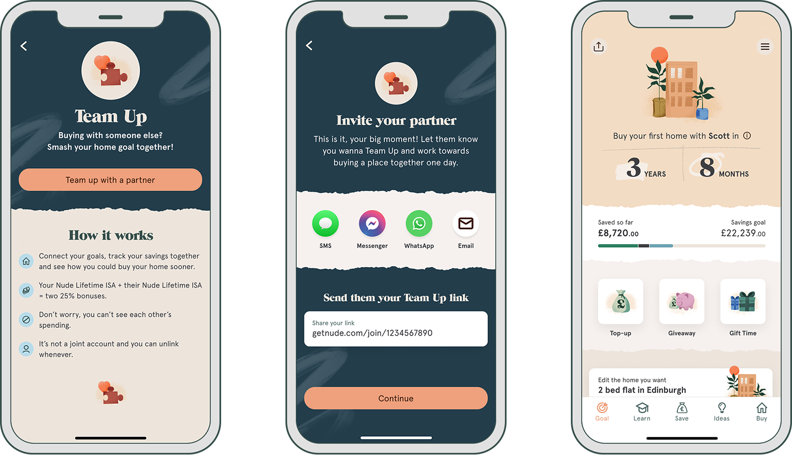
Team Up v2
Another big driver of new accounts was users transferring in from other providers. In the original flow, this was an option quite far into the journey, which was confusing for more informed users who knew they couldn’t open a new account (only one LISA is allowed). The actual transfer process itself was a manual form sent out to prospective users for them to complete themselves, a poor experience that was quite manually intensive for Nude, with noticeable drop off.
The original flow tended to lead to users dropping out at the form stage
New flow with process fully within the app
Instead we wanted to move the process into the app, a new waypoint screen early in the flow directed transfer in users into a new flow where they could choose their existing provider, enter the needed information and even digitally sign their transfer form in app. Needless to say, this was a significant improvement.
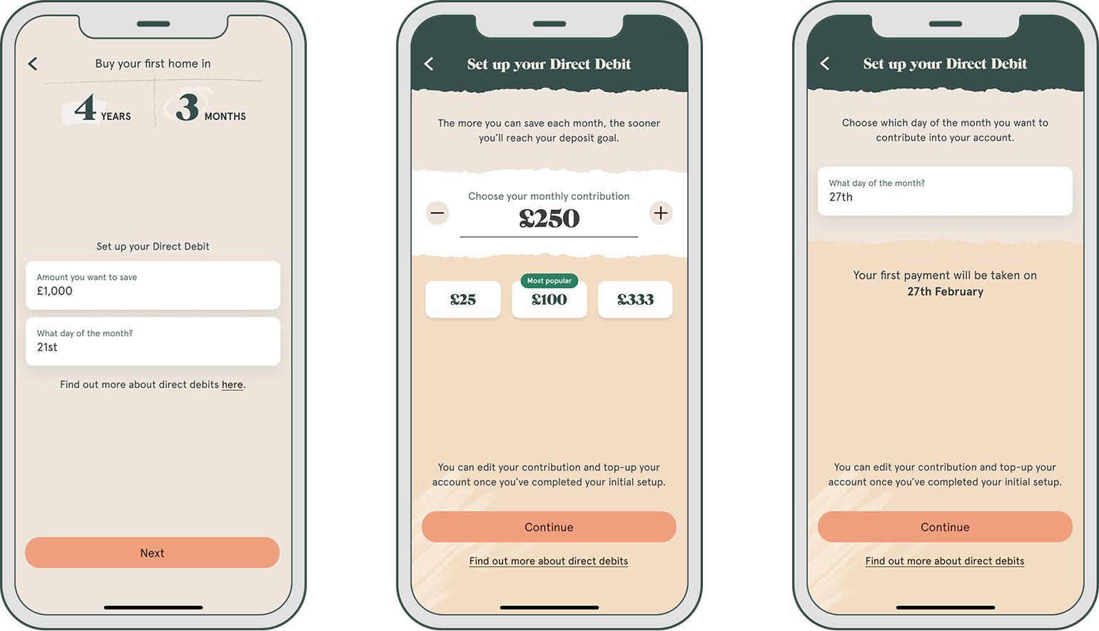
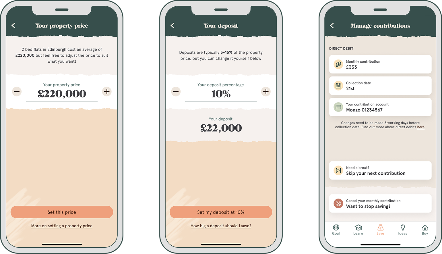
Original and updated Direct Debit controls
The final step of Nude’s onboarding requires the user to setup a Direct Debit for the amount they want to save each month. The original screen was quite simple, dominated by a version of the time to buy countdown that altered depending on the amount the user entered. There was a number of issues that we discovered with this approach after I joined the team, firstly, a large number of users actually missed that this screen was setting up a Direct Debit, confusing it with some sort of savings calculator. Secondly, we were seeing a large number of failed DD payments, usually for quite large amounts of money. Via user interviews we concluded that users had been experimenting with different amounts and progressing when they had a countdown they liked, rather than whether they could afford the amount they’d selected.
I reworked the screen, first to bring it into line with my updated visual language, as the original was a bit of an outlier. Secondly, to tackle the above issues, the countdown was dropped, to prevent that observed experimentation, and three pre canned options were added, with a ‘most popular’ £100 option (derived from internal data). Finally, amount and date was split, to be able to make extra clear when the first payment would be taken (another source of confusion).
A small update in the grand scheme of things, but one that greatly reduced failed DD payments following its release.
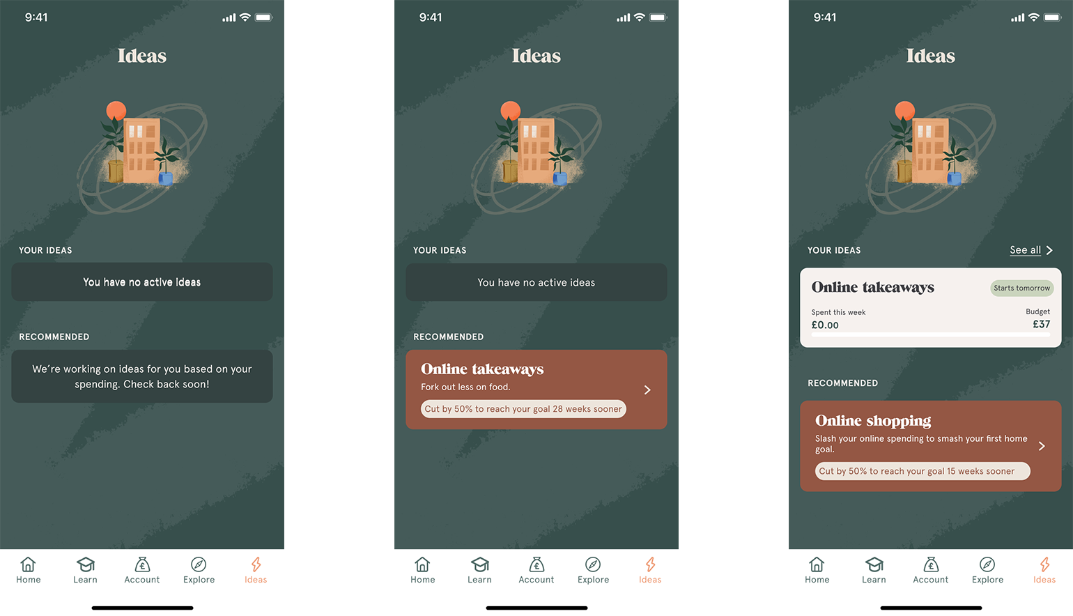
Original Ideas Section
One of Nude’s core propositions was that in return for the £2 a month fee, the user gained access to various features, including the aforementioned Team Up, but the main element was always intended to be ‘Ideas’ – essentially savings advice and challenges, the app would analyse spending and present challenges, eg, spend £x less on takeaways a week, buy your home x weeks sooner, along with some rich content to help you in your quest.
However, the section had largely been left alone since launch, awaiting a beefed up data science team to push the functionality to the next level. Even without that improvement, there was scope to make the experience better, with research suggesting a lot of users didn’t really understand what this section was all about, especially if they checked it a couple times with it in the default ‘no ideas’ state, there was really no clue as to what was going on and no real reason to keep checking it.
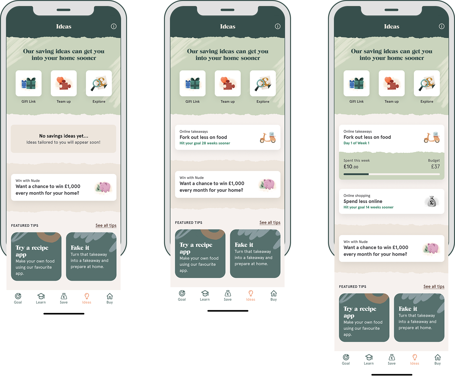
Updated Ideas
We concluded the best approach was to make Ideas seem more alive, even if a user didn’t have an active challenge. We brought in references to the other paid features, pulled in the rich ‘tip’ content that performed well in feedback sessions and added an initial landing pop up to explain what was going on.
Following its launch, traffic to the page itself and the links within it all noticeably increased, giving us a much better base to build from as the data science team worked on improving the challenges themselves. Additionally, we were able to use the same approach within the ‘free plan’ to increase awareness of these paid features to help drive conversion and customer understanding of the £2 fee and what it got them, beyond just access to the account and interest rate.
Nude has been a hugely satisfying challenge, taking an app / brand that had a strong aesthetic sense of itself and pushing it forward, improving the UX, standardising patterns and improving the execution as we pushed for growth, growing from below 1,000 to over 8,000 paid customers in less than a year, below a million to more than £18 million in deposits, increasing the monthly visits stat to an average of 9 per user, improving conversion of an average of 3% to 7% and loads more besides.
Happy to chat through any of this in more detail.
-
Q2 '22 -
Any questions, or just fancy saying hello? These links will aid you in your quest...